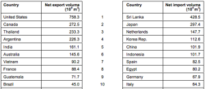
In order to understand the virtual water flows more, I decided to research imports and exports of water flow. I found this interesting chart of data that showed the top countries that EXPORT water for the use of crops, and the top 10 countries that IMPORT water for the use of crops.
The first idea that I had was to show this on a cartogram map, but without enough data to make up the whole world, I used circles of varying sizes to show the net volume of water (10^9 m^3). The Blue circles represent the exporting, and the Red represents the importing.
This can be seen in this map below, both with and without the base map. One is more informative and the other can be seen as more diagramatic and abstract, and therefore both serve a different purpose.
As well as producing this map, I also arranged the country in hierarchal order to show the top exporters and importers in this diagram below. (Assignment 2).
But after discussion I realised that the colours of red and blue for import and export were fairly redundant and that I could use the aspect of colour to represent a third component- such as where the water was flowing from or to.
For this to work I had to look for a new set of data that would give me that information and I found a set of data that tells me the flows, but by continent and not by country, and therefore I had to change a fair amount of my diagram.
While looking at this data I was getting confused with the net totals and therefore made myself a smaller data table that did not include where the water was going and just had the overall numbers to make it less confusing to chart in the initial stage.
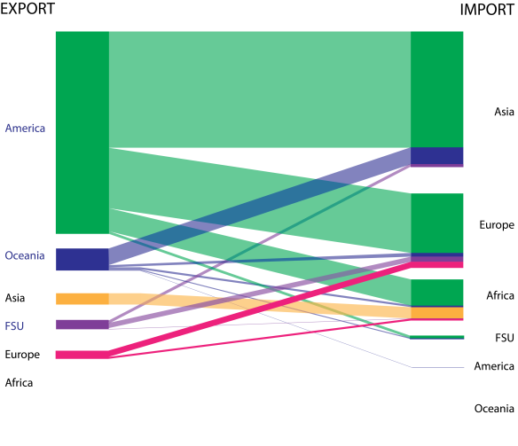
After I had this data I started to map up a mixture of the two data tables that I have, and made a flow diagram similar to my last one, but this time with more information and each countries exported water being a different colour to clearly show whose water goes where. (Sankey Diagram)
On both sides of the diagram are the continents in hierarchal order of exporters and importers. The diagram shows the breakdown of where all of the water exported goes to and the composition of all of the imported water.
These two diagrams are using data which is found on a report about Virtual Water Trade by IHE Delft on the Water Footprint Network website. This report has a lot of data on it, and I chose two of the data tables and interpreted them in different ways, one to show the spatial distribution of water flows, and the second to show the literal movement of water and how much water goes from one continent to another.


Your diagrams are very clear, and represent the information clearly!!
I like your diagrams because they demonstrate a new representation of virtual water flow, as well as, use multiple layers of information in order to illustrate a clear idea.
I like how you can tell the amount of import/export each region does based on the thickness of the line that shows to where it is going/coming from.
This is certainly an improvement over your last diagram. It more clearly represents direction of virtual water flow, while simultaneously giving a qualitative account of virtual water volume.