Final Post

This semester we looked at how everything can be considered a system, especially through the book ‘thinking in systems’.

Our first assignment of the course was to look at the site as a whole. Through the analogy of a sun diagram and were tested to see if we knew how it worked. This was a good introduction as the analysis of a site is the first thing that one will approach in looking at a new project.

Our next assignment was more diagram based and was to teach us how to take information and ideas and to portray them in a more aesthetically appealing way. This was a good start on how to diagram everything that we are looking at in a way that makes more sense, without losing any of the raw data.

With the same idea of looking at systems that exist, we learnt about the bay game and got to witness first hand how everything affects one another, and how no elements are independent from the system while still being in it. This was a really interesting portion of the course, because we were all working together for the area that we were assigned, and yet we also had individual aims such as to make an income.

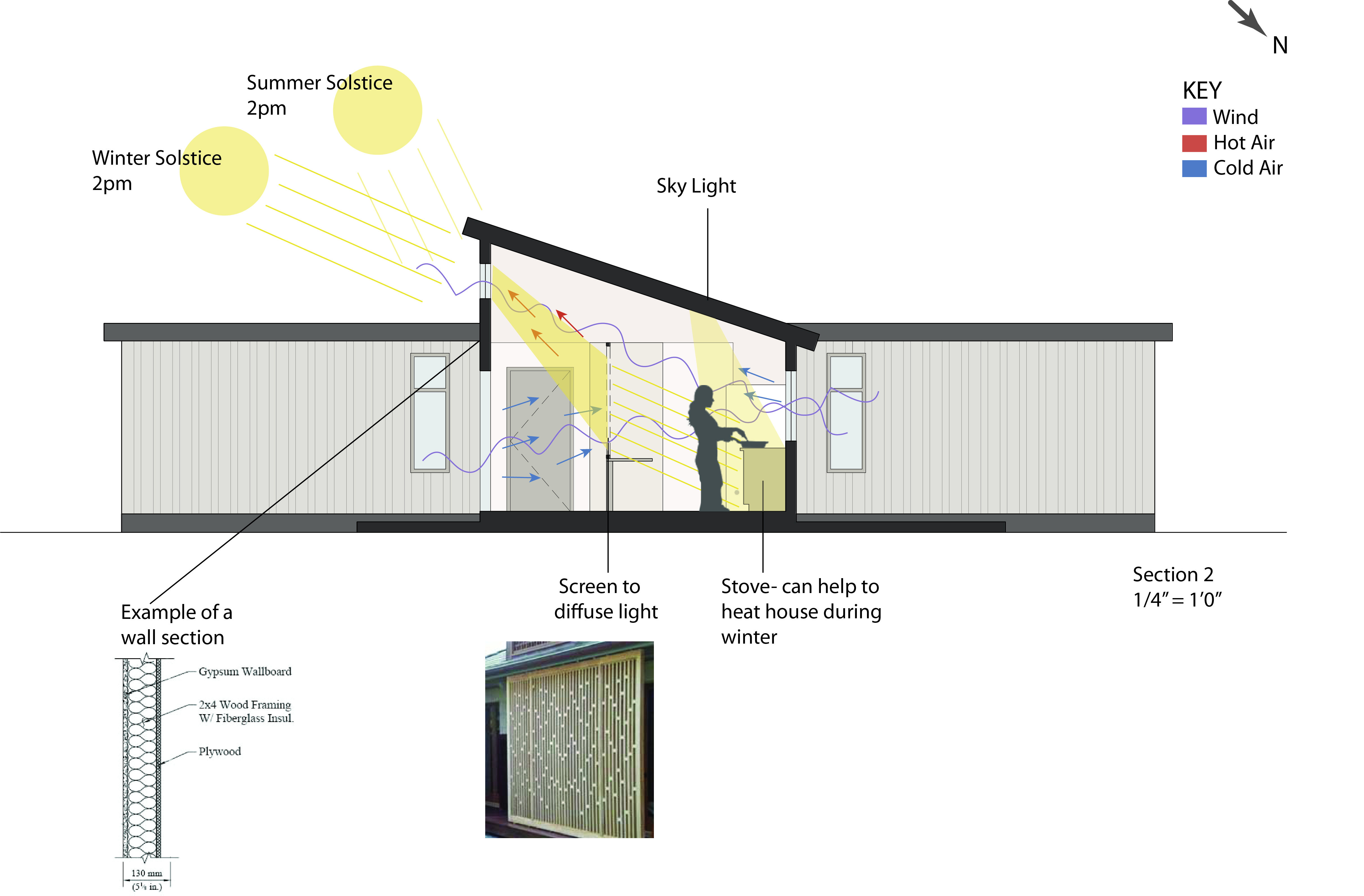
After studying systems that already exist, we then began creating our own systems. This first was applied to an undesigned scenario that we came up with (post-disaster) where the aim was to think of a system that could function in more than one way, and then we began to apply it to existing buildings and noticing how elements of their design effect the energy efficiency and the way that a building runs. We looked at isolated aspects of a building, such as one element in human scale, as well as the whole building as a system that works together. This then became even more helpful when we applied it to our studio assignments for the final assignment. This aided in the design of our studio project by applying principles discussed in class, such as cross ventilation into the placement of windows, and into the type of environment that we wanted to create.

Overall, this class has been incredibly helpful in thinking of everything as being part of a larger system and how those systems can help to make the design and space of a site function more efficiently and make it a more livable and dynamic environment.

Final Assignment (9)

This final assignment was to relate our studio project with all of the concepts that we had learnt in class.
My studio is ecoMOD and this semester I have been designing a modular home located in South Boston Virginia.

My first way to analyse the site was to look at the wind-roses for the site to see the direction of the prevailing winds.
Windroses for SoBo

After figuring out that the prevailing winds were from the SW I started to look at sun angles that are seen in the site and applied them to a site plan. I also looked at the 5 modular homes that would be built next to each other to see if they would shade each other and if the height of the buildings compared to the distance of them from one another was did not cause any additional shading.
Systems site plan

The site plan is good for showing the buildings in context with one another, but does not show any details about the building and therefore I looked at a plan and major section through the site looking at daylighting, energy capture and ventilation.
T SERIES FOR SYSTEMS

The plan here just shows the cross ventilation, the prevailing winds and where I took the section cuts from. The first section cut shows a section through both of the modules, cutting through the bedroom in one module (green), and into the kitchen and living space of the other (orange). The features that can be seen here are cross ventilation from one module through a large open doorway and out of the other window, and the inclusion of a skylight to add more natural light into the kitchen.


T SERIES FOR SYSTEMS quarter scaleThis section cut, at 1/4″ =1′ scale, shows the kitchen and living module at a more human scale. This section cut shows the pitched ceiling and the skylight as well as an example of a possible screen to help have diffused light into the kitchen space rather than solely direct light. In addition I documented the cross ventilation that I forsee taking place and the movement of cool air in through the windows and front door and then the hot air out through the clerestory window.

My modular design is meant to be as affordable as possible, and therefore it was very interesting seeing the ways that these energy principles can save money on aspects like artificial lighting through the use of apertures and natural light and ventilation.

Light and Art

This week in Lecture we started talking about light, and one of the ways that Bill Sherman approached it was to look at it through art, and in particular through the artist James Turrell. This has to have been one of my favourite lectures because I found his art very interesting and thought that it could easily relate to many works of art that I have studied/enjoyed in the past.

One of my favourite pieces of James Turrell that Bill showed was:


Because the way that light hit the block not only changed the colour of it but also gives the effect that it is floating in space.

Another of Turrell’s works that I found very interesting was:


The image on the right shows a wall, that with the right lighting looks as though it is painted white, but is actually an extrusion into the wall painting with a flat coating of white.
This piece seems like one that I would love to see peoples interactions with in a gallery. Common responses to it are people trying to touch the wall to feel the wall, but instead are left feeling as though they are going through the wall. Another, and less common response, was someone that would lean up against it expecting it to be a wall and falling backwards- something I definitely want to witness!

Looking at Turell’s work made me think about the work of the artist Anish Kapoor.

He is most popular for his works related to mirrors-

But the piece of work of his that i thought related most to lecture is

This piece of work titled ‘pregnant’ has the same illusion as the white wall that Turrelll created, with an indent into the wall that is not apparent at first. Kapoors ‘Pregnant’ is interesting as it is all curves and therefore harder to note that it extends backwards, and hard to see how far it goes back because there are no corners to help identify it.

This lecture was interesting because it showed how important light is and how it can change the perspective of the space you are in. The lighting can make a space seem bigger and therefore is important to consider when designing a space.

Assignment 8

For this Assignment, I have chosen my case study to be the Manitoba Hydro Place. It was built in 2005 and was designed by Kuwabara Payne McKenna Blumberg Architects, Smith Carter Architects and Engineers, and Transsolar (Climate Engineers).

It is located in Winnipeg, Manitoba, Canada- one of the coldest cities in the world. It has very variable weather conditions with extreme highs of 40.6°C (105°F) in August and lows of -45°C (-49°F). It has high levels of rainfall (>50mm) during May, June, July, August, and September. There is a fairly consistent average of wind speed throughout the year at around 17km/h to the S, but there has been a maximum hourly speed of 89km/h and a maximum gust speed of 129km/h. Throughout the site there are a lot of possible daylight hours.with the low being 35% in November and the high being 64.5% in July. (Winnipeg Average Climate)

This Psychometric Chart shows the temperatures and their relative humidity to help get an overview of the building’s need. As you can see from the chart the weather fluctuates a lot and therefore there is a need for varying features within the building to accomodate for a wide range of temperatures.

The Building is oriented south and there is a large southern atria, where the air is mixed up and goes through a humidifier/dehumidifier before it enters the building. This atria space is seen as a buffer zone (see images below) between the internal and external conditions so that there are no harsh transitions during the extreme climates.


Through my analysis of the site, I came up with the following set of diagrams:

These are perspective diagrams showing the temperature and air systems that occur throughout the building. In the diagram the blue represents the cool air, the red represents the warm air and the purple represents the geothermal heating/cooling.
This system has a water feature in the southern side of it (to provide humidification and dehumidification when needed), and operable windows that are constantly intaking the cool air from the outside during the winter. This cool air is then heated by the geothermal wells/field in the previously mentioned buffer zone before it enters the building.
Depending on the season- the geothermal wells can either heat/cool the offices on each floor through overhead ‘radiant ceiling slab’ (as seen in the next diagram below).
On the more northern side of the building there is a solar chimney that is only open in the summer; this takes in the excess hot air that rises in the building and allows it to escape. In the Winter however, when the chimney is closed, the warm air is used both to heat the underground garage and to help the geothermal wells heat up new cool air before it enters the building.


This is a diagram to show the impacts at a ‘human scale’; it shows the ceiling slab and its function of heating/cooling a space more clearly depending on the climate.
It also shows the operational windows that are used in the building, which are not intended to solely let light/heat in but they ensure a constant supply of fresh air.
I have included both a picture of the ceiling slab (left) and the windows (right) to help explain the diagram above.

SOURCES
http://www.archinnovations.com/news/new-projects/manitoba-hydro-kpmb-smith-carter-transsolar/
http://www.climate.weatheroffice.gc.ca/climate_normals/results_e.html?stnID=3698&prov=&lang=e&dCode=1&dispBack=1&StationName=winnipeg&SearchType=Contains&province=ALL&provBut=&month1=0&month2=12

Click to access keynote.pdf

Click to access Hydro_Case_Study_April2010.pdf

Tour of the Basement of the Architecture School

This week for our discussion we were taken around the basement of the architecture school to look at the pipes and various systems that control our school.

On entering the basement, the first thing that I noticed was the humidity of the space. The change from the cold exterior temperature and the heat that we encountered in the basement was a big change!
One of the things that I learnt from this visit is that the school is split into two parts- the first and second floor (lectures and offices) are a separate unit to the third and fourth floor (studio and more offices). This means that they both have different sets of pipes that go to them.

While looking at the pipes I was very confused as to what was in each pipe and how it was possible that there were so many- and that they were so organised. This was very interesting to see because nothing made sense to me at first glance, but it was clear that they were all in a particular order. They are colour coded to show the continuity of them, and to make it easy to identify what their purpose is for those who know the system at hand.
From looking at the state of the pipes it was easy to see which were the newest ones as they were the least rusty- and we could therefore figure out that the newest pipes were for the sprinkler system which was added in the last decade.

This tour was very interesting to help put into perspective the complexity that can occur in systems, and how many different parts there are to every system.

Mechanical Transfer

This we only had one lecture due to Hurricane Sandy, and in it we talked about the transfer of heat in a house. I learnt a lot about how ACs work and how to add a reversing value to a unit so that it can be used as both an airconditioner and a heater. This was all stuff that I have never thought about the system behind- but reminds me that there are inner systems in everything.

In relation to this class, I think it is interesting to compare all of these mechanical ways of controlling temperature with a very natural one, and my example is Frank Lloyd Wright’s Pope Leighey House.

I just visited this house for studio, and while I was walking through it, our guide was telling us all about the natural forms of heating and cooling that Frank Lloyd Wright implemented to make the house maintain a good temperature but without too much artificial light or heat. I found this absolutely fascinating as we were just studying the artificial ways, but the natural ways can also be very effective if implemented correctly.

The way in which Frank LLoyd Wright was able to make this possible was due to the size of the house and due to the amount of apertures that he had created. Throughout the entire house has a line of clerestory windows along the top part of the wall. These make it easy to create cross ventilation in all parts of the house as it is a continuous range of openings all around the house. In addition to this, there are also many large glass doors that can fully open up letting in large amounts of fresh air. These are helpful as they allow a lot of natural air in, which can be good for cooling the house down. It also helps to provide more cross-ventilation as they are large openings that can allow a large transfer of air at a higher rate than the small windows.


This is an image to show how the clerestory windows work in relation to the large doors that can fully open up. As you can see in the image, there is one vertical wall that is composed fully of these windows, and then they continue to run along the top part of the other walls.


This is a plan that I annotated to show the cross-ventilation that I could see taking place in the house when I went to see it. The only room in the house that does not have two windows on opposing sides of the room is the kitchen, but even this has a large window within it, and a way to make it a private space, which was needed in the 1940s when the house was built.
This creates a great atmosphere in the house as one is so exposed to the external world around the, but they are still in a small, enclosed and cosy space that is kept at a comfortable temperature.

Overall, I found the Pope Leighey house a very interesting case study to look at because of all of the ways it has avoiding paying money for heating and cooling as this is something we are studying in systems.

Passiv House

This week we looked at buildings as an envelope and how to create a passiv house.
We looked at the different ways that we get heat gain- with people as being one of them: (Others being direct solar, transmission due to temperature differences, plants, latent heat, lights and appliances):


I found this chart very interesting as it shows that it is especially important to think about the function of a building to decide how to heat it. If you are designing a gym, for example, then you have to have less additions of heat into it as the people themselves are a large heat gain.

In class we also talked about a passiv house- a house that has multi-layered construction that is energy efficient and uses less external energy and can be heated by the appliances within it. This was particularly interesting to me because in my studio at the moment I am looking at a passiv house and how to make a similar energy efficient house but one that is cheaper to make. One of the features of a passiv house is that it has triple glazing on the windows- this is something that is expensive to create but does reduce energy transfer. I therefore looked up the passiv haus standards and was looking up more information about them.


The basic principles of a passive house are:
– Good levels of insulation with minimal thermal bridges
– Passive solar gains and internal heat sources
– Excellent level of airtightness
– Good indoor air quality, provided by a whole house mechanical ventilation system with highly efficient heat recovery

Source: http://www.passivhaus.org.uk/page.jsp?id=17

This website has a lot of general information about the aims of a passive house and how the aim is to make them commercial and industrial- not just residential. I also found many examples of passive houses:

http://www.passivhaustagung.de/Passive_House_E/Examples_passive_houses.html

Assignment 6:

For this assignment, I was trying to think of a contrast in thermal sensation that I often experience, and I was at first trying to think of one that was positive. The moment of standing infront of a fan on a boiling hot day, or stepping inside- to warm room after being drenched in rain. I instead decided to focus on the contrast when, on a hot summers day, you are walking through the grocery store and hit the ‘freezer’ isle. This sensation, despite knowing that you will have to walk through it, is always more unpleasant than you remember, especially on a hot day where you are dressed and ready for the sun.

Looking at a typical Charlottesville summer, the temperature is normally around 85 degrees, with a humidity level of 70%. This is not a very comfortable heat, and therefore, people are often looking forward to the air conditioning of a building/a car, for a fan or a cold breeze.
Walking from a parking lot to the building you are walking on asphalt, which is known for absorbing lots of heat. It is a hot material and therefore the introduction into the cooler flooring of a concrete/marble floor of the supermarket is one of the changes of materiality that are experienced.
Temperature-wise, you are going from a hot, 85 degree temperature to a cooler, but still hot threshold of late 70s in the entrance of the grocery. This is a nice change and an even nicer one is going to the cool AC space of the rest of the store. Here there is enough time to climatise to a more static temperature. And then, there is the freezer aisle. With an inside temperature of -5 and a surrounding temperature of 59 degrees, the coldness that radiates off of the freezers is hard to miss and gives an uncomfortable chill.

After drawing out the spaces, I started to think more about the sensation of the place.
During the summer, the freezer aisle is seen as a bigger jump in temperature and more of an uncomfortable feeling than in the winter, when you are already dressed for a cooler climate. I tried to portray that with a sequence of temperature change diagrams.


The first and last bars in this show the external conditions and the darkest blue represents the coldness from the freezer.
The point of this diagram was to show how the difference in temperature would change and be more timid in colder climates, or through getting climatised into the median space for a longer amount of time.

This memory is one that I thought would be interesting to analyse because it is one that happens often but is not thought about very much. The freezers and fridges need to maintain the below freezing temperature to keep the food good, and it is just natural for the area around the freezer to be colder than the rest of the store. It is therefore not a phenomenon that is talked about a lot, but was a contrast in thermal sensations that I thought was interesting.

Importance of Climate in a design

This week in discussion we went around the school and took the temperature and relative humidity reading at various points in the school to see how different spaces vary, and marked them on a psychometric chart. To measure the readings we used temperature guns and kestrals.

The Fourth Floor Terrace, Wood-Shop Spray Station and the Nauge were all three within the comfort zone in the summer. Two of these four of these locations are outdoors and therefore, their position in the comfort chart makes a lot of sense. This shows that they are only comfortable in the winter but as they are on the edge of the comfort zone box, it shows that they are on the brink of not being with it, as later on in the winter they will not be as comfortable as they may be now. The Nauge is a very large space with lots of large glass windows that may contribute to the similar climate of the outside.
The Memorial and the Lecture hall are the two anomalies that did not fit within our comfort zone at all in this exercise. For the Memorial we chose an inner spot that was very shaded and near the hole, so was therefore also susceptible to strong winds. This would therefore make sense that it is colder than our comfort zones would want. The Lecture hall was more of a test out of interest. Due to the air handlers being shut off to avoid asbestos- the room was more humid and hot than it has ever been. We were therefore interested to see how it would fall in this chart. I was very surprised that it is on the brink of being comfortable in the summer as the room felt like a sauna on first entrance into it. However, in the summer, we would not be going from a cold outside to it like we did on Tuesday but instead we would be going from a hot, and possibly humid outside- making it make more sense that the difference in the temperature and humidity levels would not be as different.

Overall, this was a really interesting exercise as it allowed us to analyse some of the spaces that we frequent, but in a new, more technical way.

During class on thursday we did a 5 minute design exercise where, in groups, we have to come up with a passive design for a ‘reading space’. Three of the groups then had to draw their results on the chalkboard in the room and had a mini-critique. I found this to be a very interesting exercise because even in these 5 minutes, we all came up with such varied schemes! The scheme that our group came up with was one of the ones that was drawn on the board, and the problems with our design was that there was no vertical element to help absorb sun in the winter. Our design consisted of a cantilevered concrete roof, with structural columns both on the inside and outside of glass walls. These glass walls had openings in the top of them for ventilation, but a critique that we got was that there should be an opening at the bottom to let cool air in, and that the scheme should not be as symmetrical as we had made it because we had to account for the difference of the sun in the North and the South. This was a very useful exercise as it showed us that by just thinking about one aspect of a scheme you are going to miss a lot of opportunities to make a space more comfortable.

Assignment 5

For Assignment 5, I started off with knowing that I wanted to use PV cells to collect energy from the Sun. I was looking into where I should make my site, and was thinking of somewhere on the west coast, but after the lecture last week where the map of Average Daily Solar Radiation was shown (below), I decided to locate my site in Tucsan, Arizona, because it was a place that received some of the most solar radiation in the US.


After deciding my site, I wanted to make that my choice of solar radiation was correct and therefore looked at various weather resources to get maps and data about Tucsan, Arizona.

I firstly tried to find a general overview of the weather:


These diagrams helped me to decide what months to implement my scheme within. I chose May to October as it seemed like they were months where a lot of solar radiation could be captured. After this decision, I decided to look up the wind speed that Tucsan acquires to see if using wind energy was a possibility.


With these maps, it seemed pretty clear to me that Arizona does not receive as much wind energy as solar energy, and therefore would not be an efficient change/addition onto my energy scheme.

This was the diagram that I made to show the movement of energy from the source, the sun, to the different uses that I chose. I decided to show everything in one diagram rather than in a couple of zoomed in parts so that it was clear to see the system as a whole and how all of the parts relate to one another.

My scheme is to capture solar radiation through the use of PV cells on the roofs of houses. From this, the radiation goes into the PV cells and creates Direct Current. With this current I decided that some of it should be used for the use of electrical appliances that are on 24/7 but do not require a lot of energy such as batter chargers, Smoke alarms and fans. The rest of the energy that does not get used as Direct Current is then put through a transformer that changes the Direct Current to Alternating Current. This alternating current can be used for the other appliances around the house such as the main lighting and a refrigerator. In addition to both of these uses within the house, I thought that the left over electricity could be sold to the National Grid to produce an income for the people living in the house. I am hoping that the amount of sunlight that is created can have many uses, rather than just for tasks such as charging a phone.

After looking at this scheme, I started to think about the heat loss that may happen in PV cells or through anything that uses the sun. My decision, therefore, was to have a heat collector attached to the PV cells that would store the heat generated from the cells and would use it to heat up the water for the house. This would be a third function of the scheme that will hopefully save more money with minimal effort.

In terms of rethinking infrastructure/long-term solutions, I think that PV cells are a good addition to all houses in sunny areas. Although they are expensive there are many uses to them, and the more that there are the more that one can store excess energy that is created during the day and use it for the evenings.

Sources:

http://www.gaisma.com/en/location/tucson-arizona.html

http://weather.weatherbug.com/AZ/Phoenix-weather/weather-maps/surface-winds-map.html

http://www.wrh.noaa.gov/twc/aviation/windrose_TUS.php